Before & After Series: Great Room
Isn’t it fun to see the transformation of a home before and after a makeover? In this blog, I’ll walk you through the story of a great room my firm did for one of our most treasured clients.
Here are a few before photos starting at the front door. This home is a ranch-style and has no formal entryway. In addition, the kitchen/dining and living rooms are all in one larger open space. I’ll share how we created different zones with our space plan in a few minutes.


Our client had just moved in and as you can see by all the boxes, had not even unpacked. He disliked the décor so much he decided to leave the boxes until the remodel could be completed. This meant living out of one room and getting A LOT of takeout!


Everything in this house had been done in black, white, and gray. And with silver and crystal accents. Not exactly what a young bachelor might enjoy.
So, we set to work as quickly as possible. Every room needed to be addressed. We also enlisted the help of an architect we often collaborate with for a media room off the back patio. Here’s a floor plan to help you get your bearings.
The media room is in the top left corner of this plan. We needed to connect the main house with the room out back which meant adding stair steps and adding a hallway. We had the opportunity to add lots of windows to this area to gain as much natural light as possible.
I’ll cover the media room in an upcoming blog, and I hope you’ll stick around for it. Hint—Almost all of media room furnishings were custom created and we were very proud of the outcome. (Our client loved it too.)
Ok, onto the great room. You won’t believe this but from the front door to the back wall, there is a difference in elevation of 4”. Meaning…the floor sloped this much from the front of the house to back. That’s A. LOT. The home was half on slab and half on raised foundation and this was the cause of the slope.
Our client hired an engineering firm to assess the situation and it was decided the home was safe to occupy and nothing needed to be done to correct the difference in elevation.
Here are a couple of things we did to “disguise” this slope difference.
For the color palette, we chose to use the same color on the walls and the ceiling so that the eye would travel from wall to ceiling and back without interruption.
For the banquette area, the top cabinetry is level, but the toe kick is a wedge! We knew that because the chairs and table legs would (mostly) cover this wedge, it would be a good place to “make up” some of the difference.
Here’s an elevation of the banquette. Just imagine that toe kick (right side) in the shape of a gradual triangle. It was tricky.
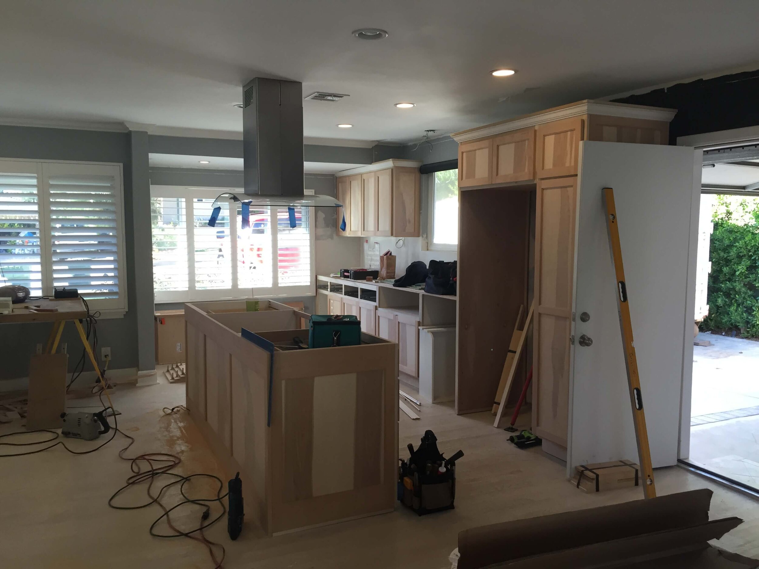
Sometimes, it’s fun to see progress shots too in a story about before and after. Here are a couple of this great room. New kitchen cabinets and countertops, lighting and plumbing fixtures were added but we kept the appliances.


Just about everything in these three “rooms” or “zones” were remodeled and resurfaced. Our client wanted a more masculine look and feel to the home (it was a ranch after all), so our palette was neutral and rugged.
Here are some after shots for these three rooms. I hope you’ve enjoyed the tour!


Are you ready to learn more about DIY Designing your own home? Check out my Course Here!
Join our newsletter below to be sure you don’t miss any updates and tips on designing your own space!

