Before & After: James and Sophie
This is the story of James and Sophie. 💗💗 (Those are not their real names but just play along =0)
James and Sophie had been married a long time. They’d raised their family and now it was their turn to create the home of their dreams. They’d lived in their house for decades and had put off decorating because at the time, kids and work came first.
Now they were longing for their home to feel grown up. It was time to create the sophistication and comfort they’d been craving for such a long time.
So, they found an architect and a builder and were off to the races.
But--a few months in, Sophie realized she needed help with selecting all of the fixtures, the appliances and finishes. Not to mention, the furniture. It was a lot to tackle on her own and she was feeling overwhelmed.
And the builder was starting to ask for selections to be made soon. Yikes!
That is where I came into their story. Along with the architect and builder, my firm completed the team.
I’d like to walk you through a part of James and Sophie’s project. You may be tackling a remodeling project of your own and perhaps this tour will give you some insight into solving some of your own challenges. The rooms included on our tour will be the kitchen, living, dining and sitting areas.
Are you ready? Let’s go!
Here are some before shots of the main living space. The kitchen, living, dining and sitting areas.


The fireplace wall was the most important and largest challenge of the entire project. James and Sophie wanted to place a TV over the FP. This was one of their main objectives. Kitchens are one of the most used rooms in a home, and having one you absolutely love is so important. If you’re thinking about doing a kitchen remodel of your own, check out this blog post.
The brick was projecting away from the wall at different depths from left to right. Also, no one could tell how thick the brick walls were until they were torn off. The firebox looked to be recessed deeply so until the demo was done, we couldn’t plan for the new design.
The wall you see where the refrigerator is in this photo would be removed in order to have a view of the living room. And more specifically, the living room fireplace. Where a TV would be installed above the fireplace so James and Sophie could sit at their kitchen peninsula and have lunch together while watching their favorite shows.
This is a photo of the sitting and dining areas off of the kitchen and living room. The wall between these four rooms would also need to shift and new doorways created for a more of a “great room” experience.
Another challenge was the ceiling heights and their treatments. In the living room, we had exposed white-painted beams with stained tongues and grooves between the beams. The kitchen had a lower, flat ceiling, also with exposed painted beams. The sitting and dining areas had a flat exposed beam and tongue and groove. This ceiling was entirely white.
As you’ll see in the AFTER photos, we faux painted the sitting and den ceilings’ tongue and groove to look like the stained tongue and groove in the living room. This way, both had white beams with “stain” in between. For the kitchen, the beams were covered up and painted white.
Here are some after photos of these rooms.


The fireplace was clad in stack stone. We added new glass doors to the firebox. The shelves remained but we dressed them up with crown molding and we added doors to the bottom shelves. The unit was outfitted with electrical outlets to showcase some small lamps for accent. And the backing was covered in a shimmery grass cloth.
A close up of the fireplace. The heart extension received a slab of stone and was brought down to the level of the newly refinished oak wood floors.
Here’s a photo of the ceiling treatment leading into the dining and sitting areas.


And this is where the love affair continues. James and Sophie got their wish to be able to sit at their kitchen peninsula and watch TV at lunch time. =0) The cabinet maker was a genius. He added sideways drawer fronts to the upper “drawers”. The door fronts then fold down and a tray much like a bread board pops out. This makes it possible to sit facing one another while eating. Adorable.
If you look closely, you’ll see how the cabinet maker blended the upper cabinets with the 7-foot tongue and groove ceilings. We chose to use the same color on the ceiling as with the cabinets because this makes for a taller room affect.
Here are two views from the dining room to the sitting room. You can see where all of the ceilings converge. The tongue and groove directly above the dining table is actually painted to look like wood.


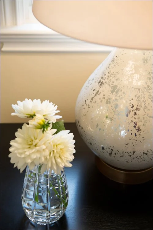
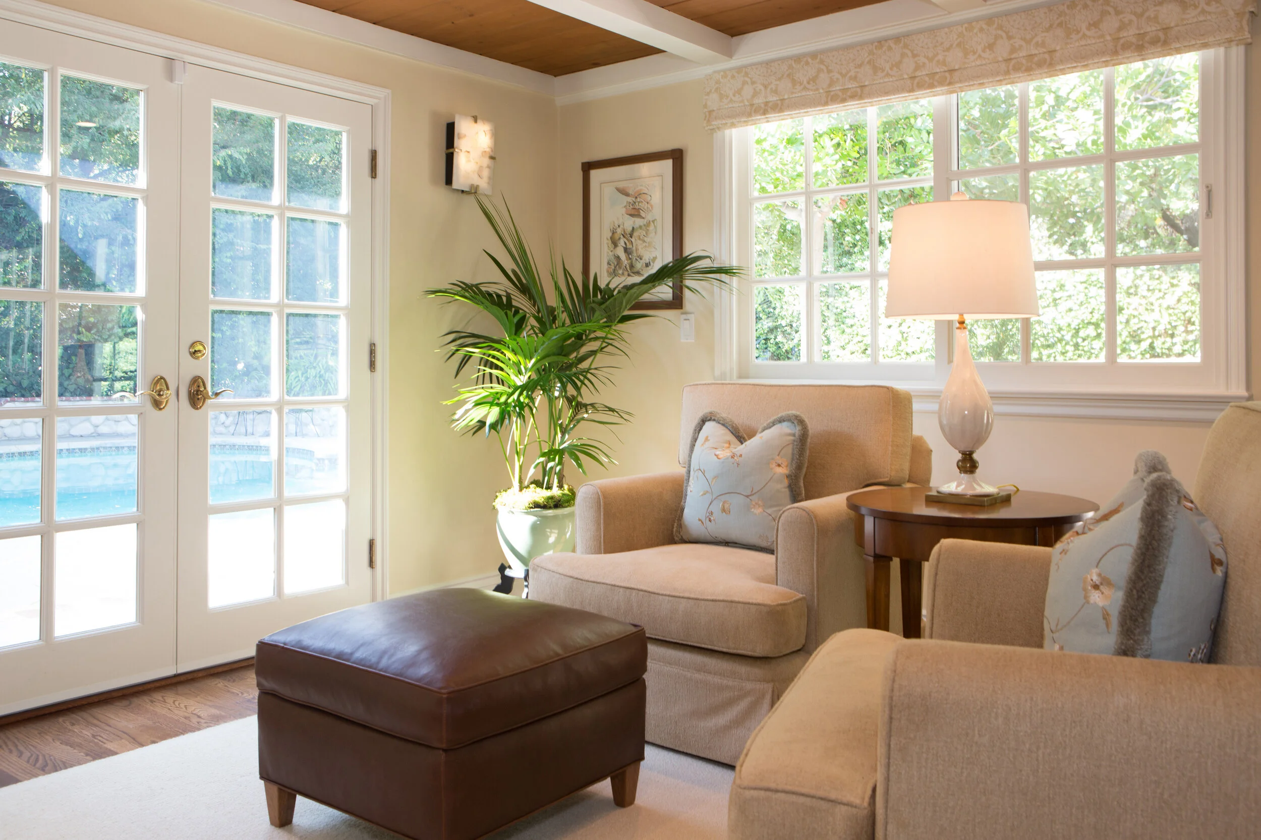
And one more photo to give you the idea of the sitting area. If you recall, there was a giant sectional in that area to begin with. Going with two comfy armchairs, ottoman, side table and table lamp provides a quiet room in which to read or just relax. And check out that beautiful pool view beyond. =0)
Here we added soft Roman shades to the windows,. They are really there to add softness and another layer of luxury more than to shield the sun. I believe in making widow treatments blend-in as opposed to calling attention to them.
This project actually included the entire home with the exception of two bathrooms. We worked with James and Sophie for about 2 years and loved every minute of it.
They were wonderful clients to work for. James and Sophie, and I wish them all the love in the world as they enjoy this new chapter in life together. 💗💗